Axis Configurations
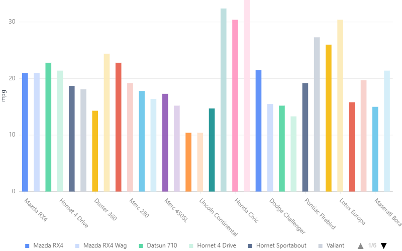
Add axis title:
chart = G2.Chart(height=500, width=800)
chart.data(df)
chart.axis('mpg',title={})
chart.interval().position('name*mpg').color('name')
chart.render()
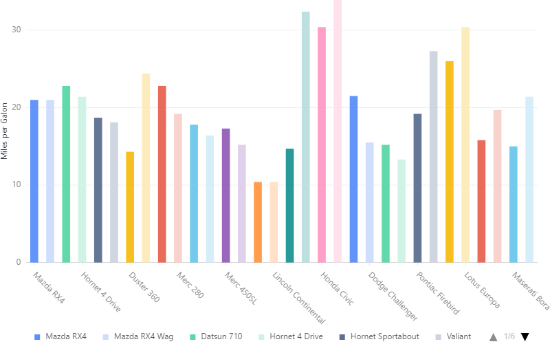
If you want to change axis name you have to add:
chart.scale('mpg',alias = 'Miles per Galon')
chart.render()
Output: